Responsive Website Design
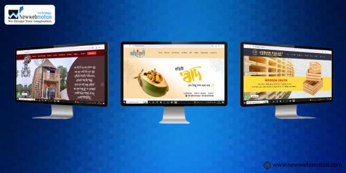
Looking for a sleek, professional, and responsive website design that looks perfect on all devices? At Newwebmotion Technology, we specialize in building dynamic, user-friendly, and mobile-optimized websites that enhance user experience and increase engagement.
Responsive website design ensures your website adapts seamlessly to any screen size—whether it's a desktop, tablet, or smartphone. It provides a consistent and optimized browsing experience across all devices, improving performance and user satisfaction.
Why Choose a Responsive Design?
- Mobile-First Approach: We prioritize mobile design to cater to the majority of modern web users.
- SEO-Friendly Code: Our designs follow the latest SEO best practices to help your site rank higher on Google.
- Lightning-Fast Load Time: Speed is key—we ensure your responsive site loads quickly on all devices.
- Cross-Browser Compatibility: Flawless performance across Chrome, Firefox, Safari, Edge, and more.
- Custom Design: Every business is unique, and so are our website layouts—tailored to your brand identity.
Benefits
- Improved SEO rankings
- Higher conversion rates
- Better user experience
- Reduced bounce rate
- One website for all devices
Newwebmotion Technology is a trusted web development company known for delivering cost-effective, responsive web design solutions for startups, SMEs, and large enterprises.